
Most analytics stacks show where people start and where they finish. The interesting part—the behavior between those points—is where money leaks out or gets made. User flow analysis turns scattered clicks into a narrative: who moved, where, in what order, and why they stalled. Below is a practical, tool-agnostic guide to understanding flows, spotting friction, and prioritizing fixes—without step-by-step setup instructions.
Why user flows beat single-page metrics
Page or screen metrics answer, “Was this touchpoint good?” Flows answer, “Did this touchpoint move people forward?” That shift uncovers:
- Hidden blockers: loops, backtracks, and “dead-end” pages that quietly suppress conversion.
- Assist value: pages that rarely convert directly but appear on winning journeys.
- Sequence effects: the same content in a different order can double or halve conversion.
Anchor on states, not URLs

Think in states (situations a user is in) and transitions (how they move). Examples of states:
- Research (category page, comparison table)
- Evaluation (pricing, calculator, demo video)
- Commitment (add to cart, start trial)
- Reassurance (shipping/returns, trust badges, implementation guide)
- Friction (form errors, slow loads, confusing filters)
Labeling flows with states lets you compare apples to apples even when layouts, query params, or page names change.
Key questions:
- Which states dominate winning paths vs. losing paths?
- Which transitions have the lowest progression rate?
- Where do users loop or bounce back (a signal of confusion)?
What to measure in flows (beyond basic drop-off)
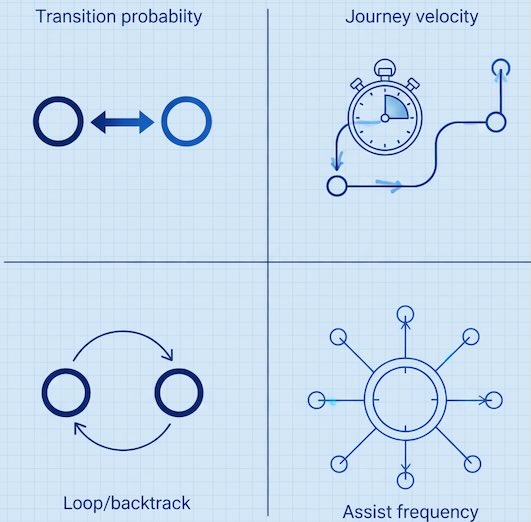
1) Transition Conversion Probability
For any step A→B, what % progresses? Low values spotlight copy or UX mismatches at that handoff.
2) Journey Velocity
Median time from one decisive state to the next (e.g., Pricing → Sign-up). Slowing velocity predicts falling conversion even before rates drop.
3) Path Coverage & Concentration
- Coverage: share of conversions explained by your top N paths.
- Concentration: how dominant the very top path is.
Healthy systems have some concentration (clear, repeatable journeys) without being brittle (all eggs in one path).
4) Backtrack & Loop Rate
Proportion of sessions that go A→B→A or A→B→C→B. High loop rates = cognitive load or missing info.
5) Assist Frequency (Winning-Path Presence)
How often a page or feature appears in converting flows vs. non-converting flows. Great for prioritizing “quiet MVPs” like FAQs, calculators, or implementation pages.
6) Drop-Off Context
Don’t just note exits; log where people came from and what they tried right before they left. It turns “exit on pricing” into “exit after toggling annual→monthly and hitting sticker shock.”
Patterns that signal friction (and what they usually mean)
- Ping-pong between product and cart: uncertainty about fees, returns, or compatibility.
- Loops among similar pages (A/B variants or colorways): choice overload; add a “best for X” label or reduce options.
- Long dwell on policy pages before drop-off: unaddressed risk perceptions; surface key reassurance earlier.
- Frequent device switches mid-journey: people research on mobile, buy on desktop—ensure parity of info and saved progress.
- Dead-end cul-de-sacs: pages with high entrances and exits but few outbound paths; add clear onward actions.
Segment flows to reveal different truths
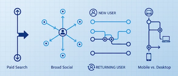
Flows are averages—segment or be misled. Useful slices:
- Traffic source / campaign intent: high-intent paid search vs. broad social.
- New vs. returning: first-timers need reassurance; returners want speed.
- Device & network quality: slow connections exaggerate form friction and image-heavy pages.
- Buyer stage proxies: visitors who used filters or pricing toggles behave differently from casual browsers.
- Geography or language: shipping, taxes, and trust signals vary by region.
Compare within the same timeframe to avoid seasonality traps.
Reading flows like a product story
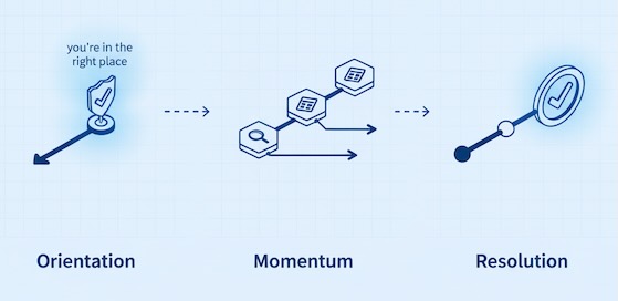
Picture three acts:
- Orientation: Did users find a relevant entry and reach a contextual “you’re in the right place” moment within 1–2 steps?
- Momentum: Are they moving through evaluation states without backtracking (filters → product → comparison → pricing)?
- Resolution: Do they reach commitment states with minimal cognitive load (short forms, clear payment, unambiguous confirmation)?
Where the story breaks, the business leaks.
Map content roles: closers, lifters, and loaders
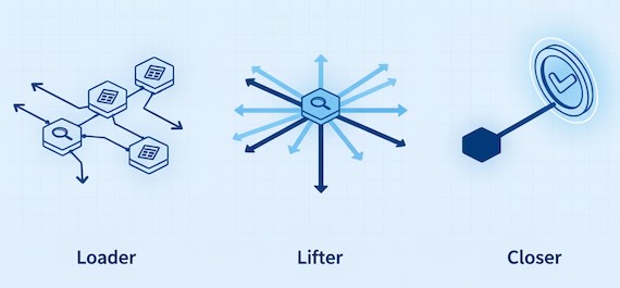
- Closers: directly precede conversion (checkout, sign-up). Optimize for clarity and speed.
- Lifters: appear repeatedly on winning paths (sizing charts, implementation guides). Invest here—they multiply the whole funnel.
- Loaders: popular but neutral (blog hubs). Use them to route visitors into lifter states with contextual CTAs, not generic banners.
Tag pages by role so stakeholders stop judging all content by last-click impact.
Micro-conversions that actually forecast revenue
Pick milestones that are necessary and predictive, not merely available:
- Used a comparison or configurator
- Viewed pricing and interacted with plan toggles
- Read returns/shipping or security/SLAs
- Saved an item, added to wishlist, or shared a quote
- Invited a teammate (for SaaS trials)
- Reached checkout step 2+ (after address or shipping selection)
Track how many journeys include these and how often they lead to the next state. These ladders provide earlier, more stable signals than final conversion rate alone.
Prioritizing fixes with a simple flow triage
- High traffic × Low transition probability (biggest leaks)
- High assist influence × Underinvested (silent multipliers)
- High loop/backtrack × High intent (frustrated buyers)
- Slow journey velocity just before conversion (last-mile frictions)
Score opportunities by Impact (revenue at risk) × Confidence (strength of flow evidence) ÷ Effort to build a clear, defensible roadmap.
Communicating insights that leadership buys
- Show the before/after path for a representative persona—pictures beat tables.
- Quantify the leak (“25k qualified sessions hit Shipping then loop back; a 15% fix equals +$180k/mo”).
- Name the “job to be done” at the broken transition (“Reassure about returns without leaving checkout”).
- Propose two options: a low-risk copy/layout change and a bolder structural change. Tie both to the same metric target (transition probability + journey velocity).
Common pitfalls to avoid
- Overfitting to rare paths. If a path explains <3–5% of conversions, treat it as a clue, not a roadmap.
- Ignoring intent mix. Flows degrade when campaign targeting shifts; compare like with like.
- Confusing correlation with causation. A page on winning paths isn’t automatically the reason they win. Look for delta when the page is present vs. absent.
- Averages hiding device pain. Mobile flows often have double the friction—always split by device.
- Single-metric myopia. Pair transition probability with velocity and loop rate to avoid “fast but lost” journeys.
A simple executive scorecard for user flows
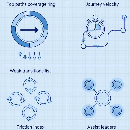
- Path Coverage: % of conversions explained by top 10 paths
- Transition Lift Targets: three weakest transitions with target % improvements
- Journey Velocity: median time across decisive transitions (aim ↓)
- Friction Index: composite of backtracks, loops, and validation errors (aim ↓)
- Assist Leaders: top 5 pages/features that most often appear on winning paths
Keep these five lines current and you’ll steer the funnel—not just report on it.
Bottom line
User flow analysis reframes conversion as a sequence of decisions, not a single event. When you analyze states and transitions, segment by intent, and measure momentum and friction—not just exits—you discover precise, high-ROI fixes. Map the hidden journey, mend the broken handoffs, and your funnel won’t just look better—it will move faster and convert more of the demand you’ve already paid to earn.
Leave a Reply