Short answer: yes—sometimes. Exit-intent popups can cut avoidable churn and lift list growth or recover revenue, if the value exchange is strong and the trigger is respectful. Recent research shows cart abandonment popups average a 17.12% conversion rate OptiMonk – Popup Statistics 2025.
What “working” really means
Define success beyond “we captured more emails.” Use a small, clear KPI stack:
- Primary KPI (one per test):
- Lead capture case: Subscriber conversion rate per exit-impression
- Commerce case: Orders or revenue per session (RPS) among eligible traffic
- Quality KPIs (to avoid vanity wins):
- Downstream purchase rate from captured emails
- Unsubscribe/complaint rate from the first 3 sends
- Average order value and refund rate (for discount popups)
- Guardrails:
- Bounce rate (by your definition), session length, pages/session
- Customer support tickets or negative feedback mentions
Stan Ventures reports that introducing exit-intent popups on product and category pages can increase conversion rates by at least 15-20%, with some blog posts experiencing a 300% boost after strategic popup implementation.Stan Ventures – Exit-Intent Pop-ups: Best Practices 2025.
Pro tip: Don’t celebrate a lower “bounce” if you merely fire a non-value event on popup view. That’s metric cosmetics, not business impact.

Where exit-intent shines
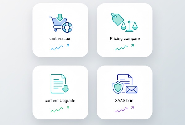
1) Checkout and cart rescue
High purchase intent + a final friction. Offers that work: free shipping, small percentage off, or a “save my cart” email. You’re not creating demand—you’re blocking a leak.
Picreel’s analysis confirms that exit-intent popups can save up to 15% of visitors from leaving and convert up to 7% into email subscribers, with further studies suggesting a 10–15% recovery rate among departing users.Picreel – Popup Statistics 2025.
2) Price-sensitive product pages
Returning price checkers often wobble on value. A modest incentive or a “compare plans” guide captures hesitators without racing to the bottom.
3) Content → lead magnet alignment
On educational pages, an exit prompt for a tightly matched download (template, checklist, calculator) converts passive readers into subscribers with future revenue potential.
4) Research-heavy SaaS pages
“Leaving? Want the 10-minute ROI brief” or “email me the security checklist” keeps high-consideration buyers in your orbit.
5) Feedback on true exits
Fast, one-question pulse—“What was missing today?”—can surface conversion blockers you won’t get from heatmaps alone.
Where they flop
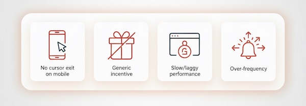
- Mobile-heavy traffic: Traditional cursor-based exit detection doesn’t exist. Back-button or inactivity substitutes are clumsy; respectful slide-ins or sticky bars usually win here.
- Generic incentives: “Subscribe for updates” rarely converts near exit. Tie the value to the page intent.
- Slow or intrusive experiences: Heavy modals can hurt perceived speed and UX—risking long-term engagement and organic performance.
- Overfrequency: Hitting the same visitor multiple times per session (or week) breeds banner blindness and complaints.
Offers that pull their weight (by journey stage)
- Top-of-funnel content: Content upgrade (the exact worksheet that matches the article), not a newsletter pitch.
- Mid-funnel comparison & pricing: “Send me a 2-min buyer’s guide” or “total cost calculator.”
- Bottom-of-funnel cart/checkout: Small, targeted incentive or reassurance element (return policy, delivery ETA), and save-cart via email for later.
Keep forms lightweight: name + email (or just email). Every extra field dents conversion.
Measurement plan executives will trust
Test design
- Randomized A/B at the visitor level where possible.
- Sample size powered for a practical lift (e.g., +10–15% relative change).
- Minimum 2–3 full business cycles to reduce novelty/weekday bias.
- Include a holdout (no popup) for at least 10–20% of eligible traffic even after launch to keep a live baseline.
Metrics to report
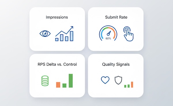
- Exposure: Eligible sessions, exit-popup impressions, impression rate (% of eligible)
- Response: Popup CTR, submit rate, error rate, “rage click” occurrences
- Outcome: Leads per 1,000 impressions, assisted orders per 1,000 impressions, RPS delta vs control
- Quality: First-30-day purchase rate from captured leads; unsubscribe rate after first campaign
Package the readout as See → Act → Pay off: Did they see it (impressions)? Did they act (submits)? Did it pay off (revenue/qualified leads)?
Interpreting “bounce rate” claims
Exit-intent popups are often sold as “bounce savers.” Reality is nuanced:
- If your analytics defines a bounce as no interaction, a popup with a tracked interaction can technically reduce bounce—but that’s only meaningful if the interaction leads to value (e.g., a legit subscription or saved cart).
- Use engaged sessions, scroll depth, and subsequent return rate to check whether you’re creating real engagement, not just poking the metrics.
Troubleshooting: why your popup underperforms
- Timing is off: Triggering before meaningful content time irritates. Tie to inactivity + exit rather than instant display.
- Offer mismatch: Coupon on an educational article; ebook on a checkout page. Align with intent.
- Frictiony form: Too many fields; unclear next step.
- Copy lacks a concrete benefit: “Stay in the loop” vs “Get the 5-minute buyer checklist.”
- Frequency fatigue: Cap per session and per week; suppress for recent submitters and paying customers.
- No audience exclusions: Don’t show trial discounts to active subscribers or show “subscribe” to people who already did.
Ethical and brand considerations
- Respect and accessibility: Clear close icon, keyboard navigation, no content shift that breaks reading.
- Polite patterns: Delay or suppress on first visit for deep content pages; don’t gate core experiences.
- Compliance: If you collect emails, follow consent norms for your regions and be explicit about what subscribers get and how often.
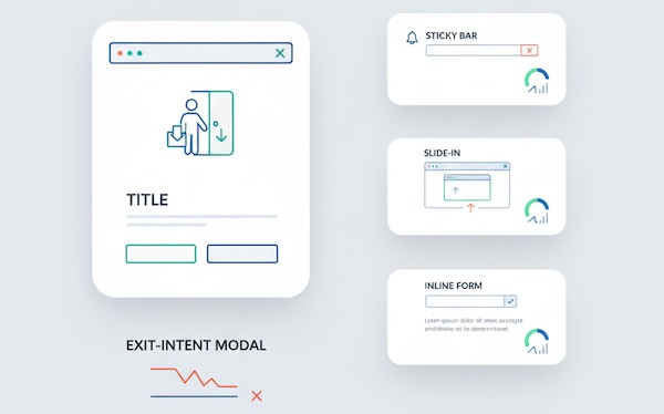
Alternatives worth testing side-by-side
- Sticky bars (mobile-friendly) with a single-line promise, persistent but unobtrusive.
- Scroll-based slide-ins at 70–80% depth (often outperform modals on content).
- Inline, context-matched forms near the value (e.g., below pricing table or at the end of a guide).
- Cart reminders in-page with microcopy rather than full-screen modals.
These often deliver similar gains with fewer UX trade-offs—especially on mobile.
A pragmatic verdict
Exit-intent popups can work, but they’re not a universal fix. Treat them like any other conversion lever: design a specific value exchange, cap frequency, segment by page intent and device, and measure with downstream quality metrics—not just form fills.
If your test plan shows:
-
- Leads per 1,000 impressions and
- stable (or better) RPS / trial starts and
- acceptable unsubscribes/complaints,
Continue Learning
More on conversion optimization:
- Beyond pageviews — measure what actually drives conversions
- User flow analysis — understand where users drop off
- Event tracking basics — track popup interactions properly
Bottom Line
If your test shows acceptable results, you’ve earned the right to keep them on. If not, pivot to lighter-weight prompts and intent-aligned offers. The goal isn’t to win a popup contest—it’s to reduce preventable churn and convert genuine interest without taxing the experience.
Leave a Reply