Tracking Setup
From Sessions to Journeys: Reading Paths Like a Pro
Stop judging users by isolated sessions. Map journeys across steps and touchpoints, then hunt for three things: segments that behave differently, bottlenecks that slow or leak value, and loops that signal confusion. Use these to find real growth opportunities—without changing your tool stack today.
Sessions vs. Journeys (and why it matters)
A session is a time-boxed visit. A journey is the sequence of states a person passes through to get something done—often over multiple sessions, devices, and channels. Sessions answer “what happened today?” Journeys answer “how do people succeed or fail over time?”
If you only look at session metrics (bounce, pages/session), you’ll optimize micro-events. Journey analysis shows the system: where intent starts, where momentum builds, and where it breaks.
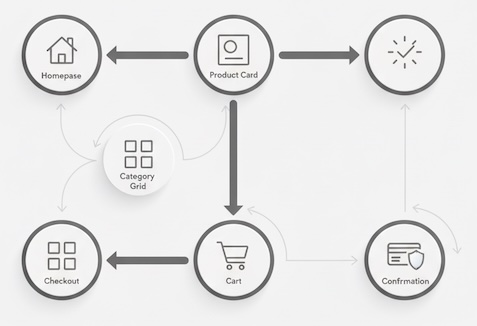
A simple model for path analysis
Think in states and edges:
- States: meaningful milestones (e.g., Homepage → Category → Product → Cart → Checkout → Order Confirmed). For SaaS: Landing → Sign-up → Onboarding Step 1 → First Value → Habit.
- Edges: the transitions between states (Category → Product; Product → Back to Category).
Read paths like a pro by asking three questions:
- Segments: Who takes which routes?
- Bottlenecks: Where does momentum stall or leak?
- Loops: Where do people circle without progress?
Segments: one path rarely fits all
Not all visitors share the same task, urgency, or familiarity. Segment journeys to avoid averaging away insights.
Useful segment lenses
- Source/intent: branded search vs. social vs. email; ad promise vs. landing reality.
- Customer stage: new vs. returning; free vs. paid; first-time buyer vs. repeat.
- Behavioral intent: skimmers (high velocity), comparers (tab hoppers), researchers (deep dwell), bargain hunters (filter/sort heavy).
- Context: mobile vs. desktop; weekday vs. weekend; geo/time zone.
What to look for
- Path divergence: Do high-value segments skip steps others rely on? (e.g., repeat customers jump straight to search and buy.)
- Shortcut states: Pages that “teleport” valuable users closer to success (e.g., site search, saved lists, pricing comparison).
- Dead-end affinity: Segments over-represented on pages with high backtracks (FAQ rabbit holes, outdated blog posts).
Output
Create 3–5 segment-specific “happy paths” (the modal successful sequences) and “struggle paths” (common sequences ending in drop-off). Those pairs reveal what to amplify vs. fix.
Bottlenecks: where momentum dies
A bottleneck is a state or edge with abnormal friction. Don’t just measure drop-off; measure stall.
Tell-tale metrics
- Step conversion (state → next key state): sudden cliffs between otherwise healthy steps.
- Median time-to-next-step: long pauses before moving on (indicates uncertainty or effort).
- Edge repetition: users retry the same transition (e.g., Product → Size Guide → Product → Size Guide).
- Forward progress ratio: forward transitions ÷ total transitions at a state.
Narratives to test
- “Cart → Shipping explodes time-to-next-step on mobile” (address entry pain).
- “Pricing → Sign-up drops when a coupon field is visible” (perceived missing deal).
- “Onboarding Step 2 has highest stall; tooltip/text mismatch with what users expect.”
Prioritize
Rank bottlenecks by impact × fixability:
- Impact: number of users affected × revenue potential per fix.
- Fixability: scope of change (copy, UI micro-interaction, policy).
Even without touching implementation, you can propose copy changes, field order tweaks, or progress indicators—low-effort, high-signal experiments.
Loops: the anatomy of confusion
Loops are repeated state patterns or backtracks (A → B → A → B), often invisible in aggregates but obvious in path diagrams.
Common web loops
- Pogo-sticking: Category ↔ Product (can’t decide; poor product info density).
- Spec hunting: Product ↔ Size/Specs ↔ Product (details hidden or ambiguous).
- Checkout churn: Shipping ↔ Payment ↔ Shipping (hidden fees, address validation woes).
- SaaS first-value maze: Feature Tour ↔ Settings ↔ Feature Tour (setup not contextual).
Loop metrics
- Loop rate: % of sessions with repeated transitions between two states.
- Backtrack ratio: transitions that reverse progress ÷ total transitions at a state.
- Attempts to success: average times a user cycles before completing the next milestone.
What loops whisper
- “Information scent is weak.” The link promised one thing; the page delivered another.
- “Microcopy misses the moment.” The question in the user’s head isn’t answered where the click happens.
- “Structure fights the task.” The user must hold context in working memory; the UI doesn’t.
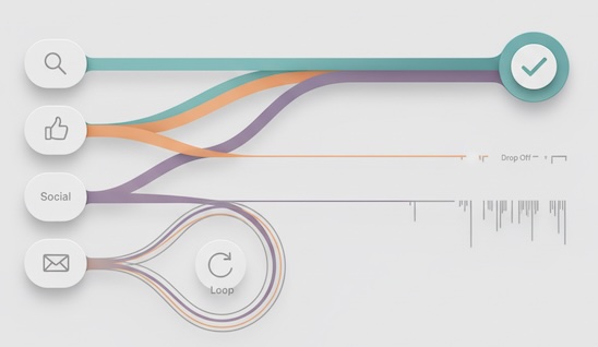
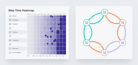
Visuals that clarify paths (choose one per question)
- Sankey/Alluvial (Where do people split/drop?): great for macro drop-offs and branch size.
- State diagram with weighted edges (Which edges are healthy?): shows dominant transitions and loop density.
- Step-time heatmap (Where do users stall?): rows=states, columns=time buckets.
- Chord diagram (Which pages ping-pong?): highlights backtracks and circular flows.
Pick the simplest chart that answers the question; more lines ≠ more insight.
What “good” looks like (benchmarks you can defend)
Benchmarks vary, but these heuristics guide interpretation:
- Happy-path coverage: If <30% of successful users follow the same top path, you likely have redundant routes or unclear wayfinding.
- Median steps to success: E-commerce add-to-cart in ≤3 page views is healthy; SaaS first value in ≤5 meaningful actions is a good north star.
- Loop rate on decision pages: >20% usually signals missing info (price, fit, shipping, integrations).
- Backtrack ratio in checkout/onboarding: aim for single-digit %; double-digits = friction.
The goal isn’t to force all users into one corridor—it’s to remove accidental complexity so intent requires fewer steps, fewer doubts, and fewer detours.
E-commerce vs. SaaS: reading paths differently
E-commerce
- Key states: Landing → Category/Search → Product → Cart → Checkout → Confirmation.
- Bottlenecks to watch: Product → Cart (information sufficiency), Shipping → Payment (fees, methods).
- Loops to watch: Category ↔ Product (comparison; add “compare,” richer photos, size help).
- High-leverage segment: returning visitors with site search—usually highest intent, shortest paths.
SaaS
- Key states: Landing → Sign-up → Onboarding Steps → First Value (aha) → Repeat Use.
- Bottlenecks to watch: Onboarding Step 2 (data import, permissions), Aha → Habit (reminders, saved views).
- Loops to watch: Feature Tour ↔ Settings (prerequisite confusion).
- High-leverage segment: trial users who complete 1–2 critical events within 24–48 hours; they define the real happy path.
Turning paths into growth opportunities
Once you’ve mapped segments, bottlenecks, and loops, convert findings into crisp hypotheses and decisions.
Hypothesis pattern
- Because [state/edge shows X friction among Y segment],
- we believe that [specific change in information, order, or reassurance],
- will [reduce stall/loops or increase step conversion by Z%],
- measured by [time-to-next-step, forward progress ratio, step conversion].
Prioritization
- Score each idea with a lightweight ICE (Impact, Confidence, Effort) or RICE (Reach, Impact, Confidence, Effort).
- Batch small copy/structure fixes first; they teach you faster which anxieties block progress.
Narrative for stakeholders
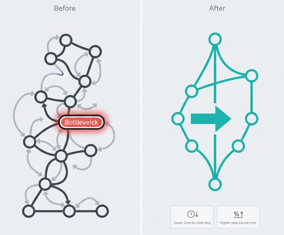
- Lead with the user job (“buyers comparing sizes on mobile”) → evidence (loop rate 28%, backtrack 2.1×) → proposed change (inline size fit guide on product) → expected lift (−30% time-to-cart; +10% product→cart).
- Show one before/after path diagram to make the story click.
Common traps (avoid these)
- Averages that lie: Mean time-on-step hides bifurcations (skimmers vs. stuck users). Use medians and segment splits.
- Counting pages, not progress: Extra pages aren’t always bad if they accelerate clarity (e.g., decision helpers).
- Overfitting to edge cases: Fix the biggest loops and stalls for the largest intent segments before chasing obscure paths.
- Tool worship: Fancy visuals won’t rescue a weak question. Start with “What is the user trying to do?” and read the graph to answer that.
Quick checklist for your next path review
- Define 5–7 states that reflect the user’s job (not your sitemap).
- Split by 3–5 segments (source, device, new/returning, buyer stage).
- Flag top bottlenecks (cliffs, stalls, repeated edges).
- Quantify loops (loop rate, backtrack ratio, attempts to success).
- Draft 3–5 hypotheses with clear success metrics.
- Tell a one-slide story: segment → friction → proposed change → expected outcome.
Bottom line
Reading journeys like a pro isn’t about memorizing every zigzag. It’s about spotting who struggles, where momentum leaks, and why people loop. When you frame paths around segments, bottlenecks, and loops, growth opportunities stop being abstract—and start looking like specific, testable wins.